
Read Also :
Color is one of the main elements of decoration. It has the ability to influence the design and people, affect the apparent proportions of space (height, width, depth), manipulate the perception of light, influence the psychology of people and in the mood, works directly the decorative style and is used to create climates and styles.
In the interior it is essential to find a color scheme that works. For this we need to know the theory of color: what color and how colors are formed. Understanding how colors work, both individually and in harmony or contrast to others, it is essential for both the amateur and for the professional decorator.

The color is not in things; the color is light. In fact, things have color. And while the light is always white, the spread makes through waves having the ability to decompose in seven colors: red, orange, yellow, green, blue, indigo (dark blue) and violet.
Each color in the spectrum is produced by a wavelength. When natural white light falls on a given object, it reflects one or a certain wavelengths and absorbs the rest. So the colors are formed, allowing you to see objects as if they really had color, but is a physical effect of reflection or absorption of light waves. For example, red bodies reflect red and absorb other colors. And so with each of the colors. The bodies which do not reflect any color and absorb all look black. Which they reflect all colors are white.
The length is the longest wave corresponding to red, and from there the lengths decrease, until the violet, which is the color with shorter wave length.
To explain color theory and to understand how the colors together and how we perceive are related, different models are used. The model used in the manufacture of paints, pigments and chemical dyes is subtractive model of Newton, the same we use to explain the theory of color in the decor.
This model is based on the color wheel, developed by physicist Isaac Newton in the seventeenth century, when it looked at the effects of a beam of light through a prism.

Primary colors
Primary colors are those pure colors that can not be obtained by mixing any other and from which we obtain, along with the black and white, any color. The primary colors are magenta, cyan blue and yellow.
Secondary Colours
The secondary colors are obtained by mixing the primary one another. Magenta and cyan are blue violet; magenta and yellow, orange; cyan blue and yellow, green.
Tertiary colors
Tertiary colors are obtained by mixing equal parts of primary and secondary colors.
Pure colors
The pure colors are those that comprise the color wheel without mixing with white, black or gray.
Refinements
A color tones obtained by adding white.
Value or intensity
Indicates the degree of brightness of a color relative to white or black. The value type or intensity is saturated color or shading off color. While the saturated color is the intensity, brilliance or purity of a color, the color off is described as "tainted" or "dirty".
Neutral colors
Neutral colors are those spanning from white to black, through gray. It includes all colors predominance of gray, raw white and shades of brown, from cream until toasted.
Warm Colors:
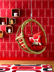
Red
Pure red is the most vital color, associated with intense and exciting action. Used pure can be somewhat violent, so should be used sparingly, in details or smaller areas. The whole range of red will -bordó, vermilion, magenta, etc., you can say the same. Lowered red with white, in tones more cakes, may instead produce comfort and warmth.

Orange
Pure orange is also a color associated with vitality, as comprising a mixture of red and yellow. As exciting as the red, it should also be used with restraint and respect, avoiding large spaces. It is always better to use combinations of weaker orange, salmon, etc.

Yellow
Yellow Decoration Style evokes strength and will. It is exciting and has its proper place in rooms with little natural light.


Blue
It is the coldest of all color. Expresses calm, quiet and repose. For its quality of sedative is useful for work areas and rooms. Mixed with green or violet, reduces its austerity and coldness. In brightly lit rooms it is not convenient to use because it absorbs light and remains bright.

Purple
Purple is a color that produces sadness. It is the religious color, mystic par excellence. It is an indifferent and distant color, able to evoke the idea of mystery. As the color of a shorter wave length, expressed deep silence and sad. By increasing the proportion of red becomes more vital and active. Increasing the blue, it accentuates its coldness and detachment. Lilac and lavender shades are marked female profile.


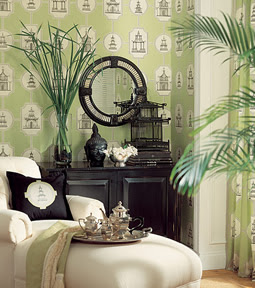
Green
As a blend color between blue and yellow, two colors of opposite characteristics, we could say that is a balanced color, expressing quiet, greenery, freshness. Pure Green is a neutral color that can be done by increasing the amount colder or warmer blue increasing the participation of yellow. The most exciting, of course, are green-yellow. On the whole it is better to use pastel colors, and only pure details.

Harmony and Contrast
The reasons for choosing a color palette can be varied. Since use color to accentuate the decorative style to do to visually alter a space. But finding a color palette, we always have two options: harmony or contrast.
Harmony
There is harmony when the integration of all colors (hues, values, etc.) produce a pleasing sight, balanced and serene unit.
Contrast
There contrast when the union of various colors produces a kind of shock that creates a more vital and dynamic chromatic unity. But beware: too violent opposition between two or more colors can cause disharmony (chromatic palette unpleasant to the human eye).
Combinations Types
In search of harmony or contrast, seeking accompany the decorative style, enlarge a room or improve lighting, for all and basically for the proper selection of a color palette, you must know the types of color combinations.
Monochrome Combination
Monochromatic combination is the simplest of all. It is to use a single color as a base and its nuances in different hues and intensities. This apparent monotony can be mitigated by applying different types of textures that are causing the contrast or using shades of color, far apart from one another, for example, light blue and dark blue.

Monochromatic combination uses a unique color and its nuances, sometimes additional color touches are also used to enforce the palette.
In the interior it is essential to find a color scheme that works. For this we need to know the theory of color: what color and how colors are formed. Understanding how colors work, both individually and in harmony or contrast to others, it is essential for both the amateur and for the professional decorator.

The Color in Decoration
The color is not in things; the color is light. In fact, things have color. And while the light is always white, the spread makes through waves having the ability to decompose in seven colors: red, orange, yellow, green, blue, indigo (dark blue) and violet.
Each color in the spectrum is produced by a wavelength. When natural white light falls on a given object, it reflects one or a certain wavelengths and absorbs the rest. So the colors are formed, allowing you to see objects as if they really had color, but is a physical effect of reflection or absorption of light waves. For example, red bodies reflect red and absorb other colors. And so with each of the colors. The bodies which do not reflect any color and absorb all look black. Which they reflect all colors are white.
The length is the longest wave corresponding to red, and from there the lengths decrease, until the violet, which is the color with shorter wave length.
To explain color theory and to understand how the colors together and how we perceive are related, different models are used. The model used in the manufacture of paints, pigments and chemical dyes is subtractive model of Newton, the same we use to explain the theory of color in the decor.
This model is based on the color wheel, developed by physicist Isaac Newton in the seventeenth century, when it looked at the effects of a beam of light through a prism.

Formation of Colors
According to the subtractive model, the colors begin to form from 3 primary colors: magenta, cyan blue and yellow. Orange, violet and green: By mixing these colors the secondary colors are obtained. Tertiary colors are obtained by mixing a primary and a secondary equally. All other colors are considered variations of these twelve basic colors, either by combinations among themselves or mixed with black or white.Primary colors
Primary colors are those pure colors that can not be obtained by mixing any other and from which we obtain, along with the black and white, any color. The primary colors are magenta, cyan blue and yellow.
Secondary Colours
The secondary colors are obtained by mixing the primary one another. Magenta and cyan are blue violet; magenta and yellow, orange; cyan blue and yellow, green.
Tertiary colors
Tertiary colors are obtained by mixing equal parts of primary and secondary colors.
Pure colors
The pure colors are those that comprise the color wheel without mixing with white, black or gray.
Refinements
A color tones obtained by adding white.
Value or intensity
Indicates the degree of brightness of a color relative to white or black. The value type or intensity is saturated color or shading off color. While the saturated color is the intensity, brilliance or purity of a color, the color off is described as "tainted" or "dirty".
Neutral colors
Neutral colors are those spanning from white to black, through gray. It includes all colors predominance of gray, raw white and shades of brown, from cream until toasted.
Warm Colors:
Red
Pure red is the most vital color, associated with intense and exciting action. Used pure can be somewhat violent, so should be used sparingly, in details or smaller areas. The whole range of red will -bordó, vermilion, magenta, etc., you can say the same. Lowered red with white, in tones more cakes, may instead produce comfort and warmth.


Orange
Pure orange is also a color associated with vitality, as comprising a mixture of red and yellow. As exciting as the red, it should also be used with restraint and respect, avoiding large spaces. It is always better to use combinations of weaker orange, salmon, etc.

Yellow
Yellow Decoration Style evokes strength and will. It is exciting and has its proper place in rooms with little natural light.


Cool Colors Decoration Ideas
Blue
It is the coldest of all color. Expresses calm, quiet and repose. For its quality of sedative is useful for work areas and rooms. Mixed with green or violet, reduces its austerity and coldness. In brightly lit rooms it is not convenient to use because it absorbs light and remains bright.

Purple
Purple is a color that produces sadness. It is the religious color, mystic par excellence. It is an indifferent and distant color, able to evoke the idea of mystery. As the color of a shorter wave length, expressed deep silence and sad. By increasing the proportion of red becomes more vital and active. Increasing the blue, it accentuates its coldness and detachment. Lilac and lavender shades are marked female profile.


Green
As a blend color between blue and yellow, two colors of opposite characteristics, we could say that is a balanced color, expressing quiet, greenery, freshness. Pure Green is a neutral color that can be done by increasing the amount colder or warmer blue increasing the participation of yellow. The most exciting, of course, are green-yellow. On the whole it is better to use pastel colors, and only pure details.


How to Match Colors in the Decor?
In any decorator decorating project has the task of choosing a color palette that works. The choice of color can meet different needs: strengthening the decorative style, improve lighting of an area with little natural light, visually expand a room, soothe the senses, etc., but in any case have to know how to choose the right color combination. The theory of color combination gives us a pattern that will guide us in the right choice of color palette. Knowing the basic patterns, we acquire knowledge and then experiment with the possible variants.Harmony and Contrast
The reasons for choosing a color palette can be varied. Since use color to accentuate the decorative style to do to visually alter a space. But finding a color palette, we always have two options: harmony or contrast.
Harmony
There is harmony when the integration of all colors (hues, values, etc.) produce a pleasing sight, balanced and serene unit.
Contrast
There contrast when the union of various colors produces a kind of shock that creates a more vital and dynamic chromatic unity. But beware: too violent opposition between two or more colors can cause disharmony (chromatic palette unpleasant to the human eye).
Combinations Types
In search of harmony or contrast, seeking accompany the decorative style, enlarge a room or improve lighting, for all and basically for the proper selection of a color palette, you must know the types of color combinations.
Monochrome Combination
Monochromatic combination is the simplest of all. It is to use a single color as a base and its nuances in different hues and intensities. This apparent monotony can be mitigated by applying different types of textures that are causing the contrast or using shades of color, far apart from one another, for example, light blue and dark blue.

Monochromatic combination uses a unique color and its nuances, sometimes additional color touches are also used to enforce the palette.


0 komentar:
Post a Comment